
Introduction
Having a mobile friendly WordPress website is crucial in today’s digital world because of the increasing number of mobile device users.
According to Statistia, mobile devices have accounted for more than 50% of internet traffic since 2017, and it may well have been close to 60% in 2022. There is no doubt that mobile is the next frontier for the internet, with internet traffic from mobile devices seeing a consistent upward trend in many countries consistently.
More people are using their mobile devices to browse the internet, shop online, and access important information than ever before. If your website isn’t mobile-friendly, it can lead to a poor user experience and deter potential customers from engaging with your brand. Additionally, Google now prioritizes mobile-friendly websites in their search rankings, so having a mobile-friendly website can also improve your visibility and drive more traffic to your site. Overall, having a website optimized for mobile devices is essential for reaching a wider audience and staying competitive in the digital landscape.
Benefits of using WordPress to build a mobile-friendly website
WordPress is a popular and versatile content management system that offers numerous benefits for building a mobile-friendly website. Firstly, it provides a range of responsive design themes that ensure your website looks great on any device. Additionally, WordPress is highly customizable, allowing you to tailor your website to your specific needs and preferences. You can easily add plugins and widgets to extend the functionality of your site and improve its performance. Moreover, WordPress is user-friendly and easy to use, making it accessible to even those with limited technical knowledge. Finally, it is SEO-friendly and allows you to optimize your content for search engines, which can increase your website’s visibility and drive traffic.
Planning your mobile-friendly website
Define your target audience and their mobile usage habits
The target audience for this product are young adults aged between 18-30 who are tech-savvy and regularly use their mobile devices for browsing the internet, social media, entertainment, and other online activities. They are likely to be students, young professionals, or individuals who are constantly on the go and require convenient, on-the-go access to information. They are likely to own high-end mobile devices, use different mobile apps frequently, and are comfortable with new technology. They value convenience, speed and efficiency in their mobile usage habits and are always looking for innovative solutions that offer them the best user experience.
Identify your website’s key content and features
When designing a website for mobile, it’s important to identify the key content and features that will provide users with the best experience on smaller screens. This involves prioritizing content and features that are essential for mobile users, such as clear navigation, simple design, and easy-to-read text. Additionally, it’s important to ensure that the website loads quickly on mobile devices, as slow load times can be a major frustration for users. By focusing on the key content and features that are most important for mobile users, designers can create a website that is both effective and easy to use on any device.
Choose a mobile-responsive WordPress theme
Choosing a mobile-responsive WordPress theme is crucial in today’s mobile-centric world. A mobile-responsive theme ensures that your website will adapt and display correctly on any device, whether it’s a desktop, tablet, or smartphone. When selecting a theme, take into account how it looks and functions on a mobile device, including its overall layout and navigation. Make sure the theme has been designed with mobile devices in mind, and that it loads quickly and is easy to navigate. Also, check if the theme is regularly updated and has good reviews. By selecting a mobile-responsive theme, you’ll ensure that your site looks great on any device and that your visitors have a positive user experience.
Optimizing your WordPress website for mobile
Use responsive design techniques
By utilizing responsive design techniques in your WordPress website, you can ensure that your site looks great and functions well across all devices, including desktops, tablets, and smartphones. This involves creating a fluid and flexible layout that can adapt to different screen sizes, using images that are optimized for various resolutions, and prioritizing important content to ensure it is easily accessible on smaller screens. By implementing responsive design, you can provide a seamless and enjoyable user experience for all visitors to your site, regardless of the device they are using to access it.
Optimize images and videos for mobile devices
It is important to optimize images and videos for mobile devices to ensure a smooth user experience. Large file sizes can greatly impact load times and increase data usage, resulting in frustration for users. To optimize images, compress them using tools like TinyPNG or Kraken.io to reduce their size without compromising image quality. It’s also important to consider the dimensions of the image and adjust them accordingly for mobile screens. For videos, use a video encoder to compress the video file size and consider using HTML5 video instead of Flash to ensure compatibility with mobile devices. By optimizing your media for mobile devices, you can enhance the user experience and increase engagement on your website or app.
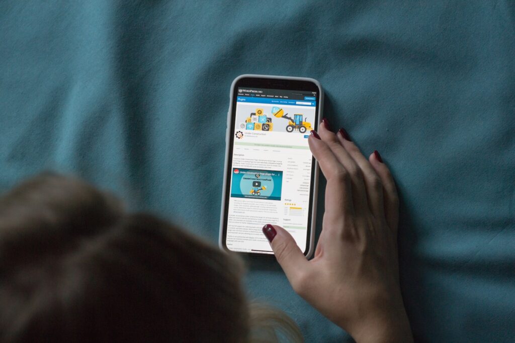
Use mobile-friendly plugins
Mobile-friendly plugins are essential for any website that wants to be accessible and user-friendly on mobile devices. With the increasing number of people accessing the internet through smartphones and tablets, it is important to ensure that your website is optimized for mobile screens. Mobile-friendly plugins can help achieve this by offering features such as responsive design, mobile-friendly navigation, and touch-friendly controls. These plugins can improve the user experience for mobile visitors, increasing their engagement and reducing bounce rates. Some popular mobile-friendly plugins include WPtouch Mobile Plugin, Jetpack, and WP Mobile Menu. By incorporating mobile-friendly plugins, you can ensure your website provides an optimal experience for all users, regardless of the device they are using.
Test your website on multiple mobile devices
Testing your website on multiple mobile devices is crucial to ensure that your website is responsive and accessible on all types of devices. With the growing number of mobile devices and different screen sizes, it is important to test your website on a variety of mobile devices to make sure that it is optimized for all users.
One way to test your website on multiple mobile devices is to use a mobile device emulator or tool that simulates different mobile devices. This allows you to visually inspect how your website will look on different devices and screen sizes. You can also perform functional testing and check for any performance issues.
It is also recommended to conduct real-world testing by checking your website on actual mobile devices. This can be done by borrowing devices from friends or family, or by using a device lab or testing service. By testing on real devices, you can ensure that your website is fully functional, accessible, and optimized for all users.
Tips for improving mobile user experience
Simplify navigation
One of the most important aspects of improving mobile user experience is to simplify navigation. This means making it easy for users to find what they’re looking for on your website or app, without having to click through multiple pages or menus.
Here are some tips for simplifying navigation on mobile:
- Use a clear and concise menu: Make sure your menu is easy to read and understand. Use clear labels and organize your menu items logically.
- Limit the number of menu options: Too many options can be overwhelming for users, so try to limit your menu to the most important items.
- Use drop-down menus: If you have a lot of menu items, consider using drop-down menus to keep the main menu clean and organized.
- Use breadcrumb navigation: Breadcrumb navigation is a great way to help users keep track of where they are on your site and how they got there.
- Use search: Make sure your search bar is easy to find and use. This can be especially helpful for users who are looking for something specific.
By simplifying navigation on mobile, you can help ensure that users have a positive experience on your website or app, which can lead to increased engagement and conversions.
Use clear and concise content
When it comes to improving mobile user experience, one of the key factors is using clear and concise content. Mobile users tend to have shorter attention spans and limited screen space, so it’s important to get your message across quickly and effectively. To achieve this, focus on using short and easily digestible sentences, bullet points, and headings. Avoid lengthy paragraphs and unnecessary jargon that might confuse or frustrate users. Additionally, make sure your font size is easy to read on a small screen, and use images or videos to break up text and add visual interest. Overall, the clearer and more concise your content, the better the mobile user experience.
Optimize your website’s loading speed
One of the most crucial aspects of mobile user experience is the loading speed of your website. As more and more people access the web on their smartphones, slow loading times can lead to high bounce rates and lost conversions. To optimize your website’s loading speed for mobile devices, you can start by minimizing the size of your images and videos, leveraging browser caching, and reducing the number of HTTP requests. You can also use a Content Delivery Network (CDN) to distribute your content across different servers and reduce the distance users’ devices need to travel to access it. Finally, make sure to test your website’s loading speed on different devices and browsers to ensure a seamless experience for all mobile users.
Consider using mobile-specific features like click-to-call buttons
When designing a website or application for mobile devices, it is important to consider the unique features and limitations of these devices. One important consideration is the use of mobile-specific features like click-to-call buttons. These buttons allow users to quickly and easily call a business or organization with a single tap on their phone screen. By making it easy for users to contact you, you can improve their overall experience and increase the likelihood of them becoming a customer or client. In addition, click-to-call buttons can improve the accessibility of your website or application for users with disabilities, such as those who have difficulty using a traditional phone keypad. Overall, incorporating mobile-specific features like click-to-call buttons can help to create a more user-friendly and engaging experience for your mobile audience.
Conclusion
Having a mobile-friendly website is crucial in today’s digital landscape. With more and more people accessing the internet through their mobile devices, a website that is optimized for mobile screens can mean the difference between attracting and retaining customers or losing them to competitors. A mobile-friendly website provides an improved user experience, allowing customers to easily navigate and interact with your website on their mobile devices without having to zoom or pinch to view content. This can increase engagement, reduce bounce rates, and ultimately lead to higher conversion rates. Additionally, a mobile-friendly website can improve your search engine rankings and expand your reach to a wider audience.